Today my second book, Bisection, is available in online stores.
I told you pretty much everything about it in my last post, so I’ll explain a little about the symbolism of the cover today.
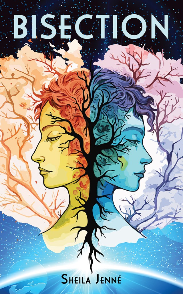
The main characters don’t look like this exactly–they only have one face between the two of them, and their skin isn’t an unusual color for humans. I chose this picture because, symbolically, it shows how the two characters relate to each other: they are inextricably connected, while at the same time not at all the same, or even paying attention to the same things.
Tria is the right. She is pictured in cool colors because she is calm and detached. Her eyes are open because she is the one who usually speaks for both of them and is noticed by others.
Resa is the left. Her warm colors show her intense emotion and creativity, but her eyes are closed. She often seems passive, but that might be something of an illusion. Her side of the story often gets missed by everyone but herself–and even the sections she narrates, she won’t tell us everything. Is that a tear coming out of her eye? There’s a lot that Resa is sad about, and when she’s sad, she cries easily.
When the two of them leave their planet for the stars, the relationship between them seems pretty much fixed. They’ve related in the same way their whole lives. And yet new environments bring out new sides to both of them, destabilizing their partnership in ways they don’t understand or know how to respond to.
If you buy and read Bisection, please leave a review. Even if it’s negative, it still shows that my book is being read. Goodreads or whatever store you purchased the book from are both great places to leave reviews.
